Project Overview
Recruiting teams often manage complex hiring processes involving hundreds of candidates, multiple interviewers, and large amounts of unstructured information. Despite the rise of recruiting platforms such as Ashby, Greenhouse, and Lever, much of the decision-making still relies on manual analysis of resumes, scattered interview feedback, and subjective judgment.
TalentCopilot explores how AI can transform the hiring workflow by acting as a decision-support system for recruiters and hiring teams.
The goal of this project was to design a product that helps recruiters analyze candidates faster, prepare better interviews, detect hiring bias, and make more confident hiring decisions.
.
The Problem
Modern recruiting workflows face several structural challenges.
1. Information overload
Recruiters often review hundreds of resumes and candidate profiles for a single role.
2. Fragmented hiring insights
Interview feedback from multiple stakeholders is difficult to synthesize.
3. Inconsistent evaluation
Different interviewers assess candidates using varying criteria.
4. Limited transparency in hiring decisions
Hiring managers often struggle to understand why a candidate was recommended.
These problems slow down hiring and increase the risk of poor or biased decisions.
Opportunity
AI can help recruiters make better decisions by transforming raw candidate data into structured insights.
TalentCopilot was designed to support recruiters throughout the entire hiring lifecycle, from job creation to final hiring decision.
The system focuses on:
• AI-powered candidate analysis
• structured hiring workflows
• interview preparation assistance
• bias detection and diversity insights
• hiring recommendation reports
Rather than replacing recruiters, the AI acts as a copilot that augments human judgment.
Product Vision
TalentCopilot aims to function as an intelligent operating system for hiring teams.
The design emphasizes:
• structured decision-making
• transparency in AI insights
• streamlined collaboration between recruiters and hiring managers
The product treats AI not as a chat interface but as an embedded assistant integrated into the recruiting workflow.
Target Users
Recruiters
Primary users responsible for managing candidate pipelines and coordinating interviews.
Hiring Managers
Stakeholders responsible for final hiring decisions.
Interviewers
Team members who evaluate candidates during interview stages.
Each user interacts with the system differently but contributes to the same hiring workflow.
Product Architecture
The system was designed using a four-layer architecture.
User Layer
Recruiters, hiring managers, and interviewers interact with the platform.
Workflow Engine
Manages the recruiting lifecycle including candidate pipelines and interview coordination.
AI Intelligence Layer
Analyzes candidate data, interview feedback, and hiring patterns to generate insights.
Data Layer
Stores resumes, job requirements, interview feedback, and hiring analytics.
This architecture ensures the AI assistant is integrated into the workflow rather than existing as a separate tool.
Hiring Workflow Design
1. Job Opening Creation
Recruiters begin by defining a new role.
The AI assistant helps generate structured job descriptions, responsibilities, and interview criteria based on role requirements.
This reduces the time needed to create high-quality job postings.
2. Candidate Sourcing
Candidates enter the system from multiple channels including applications, referrals, and outreach.
AI automatically extracts skills and experience from resumes and highlights promising candidates for review.
3. Resume Screening
Instead of reading every resume manually, recruiters see a structured candidate intelligence summary.
The AI identifies:
• candidate strengths
• relevant technical skills
• experience highlights
• potential gaps
This allows recruiters to evaluate candidates more efficiently.
4. Interview Planning
Recruiters prepare interview stages and assign interviewers.
The AI assistant generates role-specific interview questions tailored to the candidate’s background.
This helps standardize the evaluation process across interviewers.
5. Interview Evaluation
After interviews, feedback from different interviewers is aggregated.
The AI analyzes evaluation patterns and highlights recurring strengths and concerns.
This transforms scattered feedback into clear insights.
6. Bias Detection and Diversity Insights
The system monitors the hiring pipeline for potential bias.
Analytics dashboards visualize:
• candidate demographic distribution
• pipeline diversity trends
• stage drop-off patterns
The AI can alert recruiters when potential bias is detected.
7. Hiring Decision and Offer
The final stage compiles candidate data into a structured hiring recommendation report.
The AI evaluates:
• skill alignment
• interview performance
• experience relevance
Recruiters and hiring managers can then review a transparent recommendation before making the final hiring decision.
Key Product Screense
The product interface is structured around several key workspaces.
Hiring Dashboard
Provides an overview of open roles, pipeline metrics, and hiring progress.
Candidate Pipeline
A visual kanban-style board that tracks candidates through hiring stages.
Candidate Profile
Detailed view including resume, experience timeline, and AI-generated insights.
AI Copilot Panel
A persistent assistant that answers recruiter questions and surfaces insights.
Interview Preparation Workspace
Helps recruiters generate interview questions and evaluation criteria.
Diversity Insights Dashboard
Visualizes hiring patterns and identifies potential bias.
Hiring Recommendation Report
Provides a structured summary of candidate evaluation.
Interaction Design
The interface uses subtle motion to communicate AI activity.
Examples include:
• AI insight cards appearing dynamically
• candidate pipeline updates when stages change
• feedback analysis indicators updating in real time
These interactions help communicate the system’s intelligence while keeping the interface focused and professional.
Design Principles
Several principles guided the design.
Transparency - Users should understand how AI insights are generated.
Structured decision-making - Candidate evaluation should be organized and consistent.
Collaboration - Recruiters and hiring managers must easily share insights and feedback.
Fairness - Hiring decisions should be supported by analytics that reduce bias.
Potential Impact
TalentCopilot aims to improve hiring outcomes by:
• reducing time spent reviewing resumes
• improving consistency in candidate evaluation
• supporting fairer hiring practices
• helping teams make better hiring decisions
By combining workflow management with AI-driven insights, the product demonstrates how recruiting platforms can evolve into intelligent hiring systems.
Reflection
Designing TalentCopilot highlighted the importance of integrating AI directly into professional workflows rather than treating it as a standalone feature.
The project explores how AI assistants can support complex decision-making processes while maintaining transparency and human control.
Project Overview
The web contains an enormous amount of information, but traditional browsers were designed primarily for viewing webpages, not for understanding or synthesizing knowledge.
Tools like Google Chrome and Arc Browser provide powerful browsing capabilities, yet they still rely on users to manually read, organize, and interpret information across dozens of tabs.
Atlas explores a different future: a browser designed not just to display the internet, but to help users think, research, and generate insights while browsing.
Atlas integrates an AI assistant directly into the browsing environment, transforming the browser into a knowledge workspace for researchers, analysts, and curious learners.
.
The Problem
Problem
Despite the internet’s vast knowledge, the way people browse information remains inefficient.
1. Information overload
Users often open dozens of tabs while researching a topic, making it difficult to keep track of sources and ideas.
2. Fragmented understanding
Important insights are scattered across multiple articles, requiring users to manually synthesize information.
3. Poor research organization
Most browsers lack built-in tools for organizing research and building knowledge structures.
4. Limited support for thinking workflows
Browsers help users access information but offer little assistance in understanding or connecting ideas.
These limitations make research slower and cognitively exhausting.
Opportunity
Advances in AI make it possible for browsers to actively support the thinking process.
Instead of acting as passive windows to the internet, browsers can become intelligent research environments that help users:
• understand complex content quickly
• connect ideas across sources
• organize research automatically
• generate insights from browsing activity
Atlas was designed to explore this next generation of AI-native browsing experiences.
Product Vision
Atlas aims to transform the browser from a page viewer into a thinking companion.
The product integrates AI directly into the browsing workflow to support:
• knowledge discovery
• research organization
• idea synthesis
Rather than forcing users to switch between tabs, notes apps, and AI tools, Atlas brings these capabilities together in a single intelligent environment.
Target Users
Atlas is designed for people who regularly work with complex information.
Researchers and analysts
Professionals who must analyze multiple sources and synthesize insights.
Students and academics
Users conducting deep research for projects, papers, and learning.
Knowledge workers
Product managers, strategists, and journalists who constantly gather and evaluate information.
These users benefit from tools that help them structure and interpret knowledge efficiently.
Product Architecture
Atlas was designed using a three-layer browsing architecture.
Browsing Layer
Handles traditional browser tasks such as rendering webpages and managing tabs.
AI Intelligence Layer
Analyzes webpage content, identifies relationships between sources, and generates insights.
Knowledge Layer
Stores structured information extracted from browsing activity, including summaries, concepts, and connections.
This architecture enables Atlas to convert raw browsing activity into organized knowledge structures.
Key Product Experiences
The Atlas interface introduces several features designed to support research workflows.
AI Page Intelligence
When users open a webpage, Atlas generates an AI-powered summary overlay.
The system identifies:
• key insights
• important quotes
• main arguments
• estimated reading time
This allows users to quickly evaluate whether a source is worth reading in detail.
Research Sidebar
Atlas includes a persistent AI research assistant integrated into the browsing interface.
Users can ask questions about the current page or request deeper explanations.
Example interactions include:
• summarizing articles
• explaining technical concepts
• comparing information across multiple tabs
This enables users to interact with web content conversationally.
Smart Tab Clusters
Instead of managing dozens of individual tabs, Atlas automatically organizes tabs into AI-generated research clusters.
For example:
AI Regulation Research
Climate Policy Articles
Startup Market Analysis
This helps users maintain a clear structure when researching complex topics.
Knowledge Graph
One of the most powerful features of Atlas is a visual knowledge graph.
As users browse, Atlas identifies relationships between sources and builds a dynamic map showing how ideas connect.
The graph allows users to:
• explore related topics
• identify conflicting viewpoints
• understand the broader context of a subject
This transforms research from a linear activity into a visual exploration of ideas.
Research Notes Workspace
Atlas automatically generates structured notes from browsing sessions.
These notes include:
• page summaries
• extracted quotes
• key concepts
• AI-generated insights
Users can edit and organize these notes into research documents.
This eliminates the need to manually copy information between multiple tools.
Insight Report Generator
Atlas can convert research sessions into structured reports.
These reports include:
• summaries of key findings
• arguments across different sources
• conflicting perspectives
• suggested conclusions
This feature turns browsing activity into actionable knowledge outputs.
Design Principles
Several principles guided the design of Atlas.
Augment thinking
The browser should assist users in understanding information, not distract them.
Reduce cognitive load
AI should simplify complex research tasks rather than adding additional complexity.
Preserve user control
Users should always understand how insights are generated and retain control over their research.
Integrate AI naturally
AI capabilities should be embedded directly into browsing workflows rather than appearing as separate tools.
Potential Impact
Atlas demonstrates how AI could transform the browser into a knowledge intelligence platform.
Potential benefits include:
• faster understanding of complex topics
• improved organization of research
• better synthesis of information across sources
• more efficient knowledge creation
This project explores the future of browsing as an AI-assisted thinking environment.
Reflection
Designing Atlas highlighted how deeply the browser shapes how people interact with knowledge online.
While traditional browsers focus on accessing information, the next generation of browsers may focus on understanding information.
Atlas explores how AI can help transform the web from a collection of pages into a connected knowledge system.
Project Overview
Research today is fragmented. Analysts, journalists, and researchers often open dozens of browser tabs, manually verify sources, and spend hours organizing insights. While AI tools like ChatGPT and Perplexity AI provide quick answers, they still present information primarily in conversational formats, which can make complex research difficult to structure and verify.
InsightAI explores a different approach: an AI-powered research workspace that transforms scattered information into structured intelligence.
The goal was to design a product that helps professionals discover, verify, organize, and export research insights quickly and transparently.
.
The Problem
Modern research workflows suffer from three core problems:
1. Fragmented information
Users must search multiple sources and manually piece together insights.
2. Lack of source transparency
AI-generated answers often hide how conclusions were formed.
3. Poor knowledge organization
Insights are typically delivered in long text blocks rather than structured analytical views.
These issues create friction for professionals who need credible, organized information quickly.
Opportunity
Design an AI research assistant that:
• gathers and analyzes multiple sources
• organizes insights into structured clusters
• highlights conflicting viewpoints
• provides transparent source credibility
• converts findings into professional reports
Instead of acting as a chatbot, the product would behave like an analytical research workspace.
Target Users
Analysts - Professionals researching economic, geopolitical, or technology trends.
Journalists - Reporters who need rapid background research and credible sources.
Researchers and students - Users synthesizing large volumes of information.
Product Vision
InsightAI was designed around one central principle:
AI should augment structured thinking, not replace it.
Rather than presenting information as a conversational thread, the interface focuses on insight clusters, source intelligence, and research workflows.
The result is a product that feels closer to an intelligence analysis platform than a traditional AI chatbot.
Product Experience
The product experience is built around seven core screens, forming a complete research workflow.
1. Research Home
The home screen reduces friction when starting a new research query.
A large prompt field invites users to ask complex questions, while suggested prompts help guide exploration.
The sidebar organizes previous research topics and saved collections, turning the workspace into a persistent knowledge hub.
2. AI Research Processing
When a user submits a query, the system shows transparent progress indicators.
The interface displays stages such as:
• gathering sources
• evaluating credibility
• detecting conflicting viewpoints
• organizing insights
This transparency helps users trust the AI’s analytical process.
3. Research Results Dashboard
The results screen acts as the core intelligence dashboard.
The interface is divided into three sections:
Research navigation
Folders and saved queries for ongoing projects.
Insight clusters
AI-generated themes such as economic impact, political reactions, or technological implications.
Source intelligence panel
A list of sources with credibility indicators and publication details.
This layout enables users to quickly understand both what the AI concluded and where the information came from.
4. Insight Deep Dive
Users can explore specific insight clusters in detail.
Each deep-dive view provides:
• expanded explanations
• supporting citations
• contextual charts or timelines
• related insights for further exploration
This screen transforms AI outputs into structured analytical narratives.
5. Source Verification
To address trust concerns in AI systems, InsightAI includes a dedicated source verification interface.
Sources are evaluated using credibility indicators and publication metadata.
The interface also visualizes source diversity, showing geographic and ideological balance across referenced publications.
This design encourages critical evaluation of information.
6. AI Follow-Up Research
After generating results, the system recommends deeper research questions.
These prompts help users expand their investigation and discover related insights without starting new searches manually.
This feature turns research into a continuous discovery process.
7. Research Report Generator
InsightAI enables users to convert insights into structured reports.
Generated reports include:
• executive summaries
• key findings
• supporting evidence
• source citations
Reports can be exported or shared, making the product useful for professional workflows.
Design Principles
Several principles guided the design process.
Transparency
Users should always understand how insights were generated.
Structured thinking
Information should be organized into visual clusters rather than long text blocks.
Research continuity
The workspace should allow users to build knowledge over time.
Trust
Credibility indicators and source transparency help users verify conclusions.
Interaction Design
Subtle motion cues reinforce the AI’s analytical process.
Examples include:
• scanning animations during research
• progressive loading of insight clusters
• dynamic credibility indicators
These interactions help communicate system intelligence without overwhelming the user.
Potential Impact
InsightAI aims to transform research workflows by:
• reducing time spent searching across sources
• improving trust in AI-generated insights
• helping professionals structure complex information quickly
The concept demonstrates how AI systems can move beyond simple conversation interfaces toward structured intelligence platforms.
Reflection
This project explores how AI can support human reasoning rather than replace it.
By focusing on transparency, structured insight visualization, and research workflows, InsightAI proposes a design direction
for the next generation of AI-powered knowledge tools.
Project Overview
Flowforge is an enterprise-ready automation platform designed to help teams build, monitor, and scale workflows without operational complexity.
It addresses a critical gap in the automation market: existing tools are either too technical for non-engineers or too abstract to debug reliably at scale.
Flowforge combines a visual workflow builder, AI-assisted configuration, and real-time execution visibility into a single, structured system built for daily professional use.
The goal was to design an automation platform that teams can trust — not just to build workflows, but to understand and control them.
.
Flowforge uses a dark-first, premium interface to reinforce technical credibility
Automation platforms operate in high-impact environments where:
• Structured grid and strong spacing discipline
• Subtle red/orange glow accents for primary actions only
• Glassmorphism restrained to surface-level cards
• Monospaced numerics for logs and metrics
• Calm, confident tone throughout
Visual effects are purposeful — guiding attention, not distracting from execution clarity.
The identity signals a tool built for serious teams operating at scale.
The Problem
Automation platforms operate in high-impact environments where:
• Workflows silently failing can disrupt operations
• Debugging is often opaque and fragmented
• Permissions must prevent accidental system changes
• Execution visibility is critical for scale
• Non-technical users require clarity without oversimplification
Most solutions either overcomplicate workflows or oversimplify clinical needs.
The opportunity was to design a system that makes automation understandable, observable,
and controllable — without sacrificing power.
Senior Product Designer & Systems Architect
I led:
• End-to-end product architecture
• Workflow lifecycle modeling
• Dashboard system design
• Visual builder interaction logic
• Execution log structuring
• Role-based permission modeling
• Error and retry experience design
• Design system and visual language definition
AI-assisted prototyping accelerated iteration, while I retained full ownership of system structure,
interaction standards, and product clarity.
Marketing & Positioning
Clear, credibility-first messaging:
“Automation that teams can actually trust.”
Structured hero, restrained animation, and immediate product previews establish maturity.
Authentication & Team Setup
• Organization creation
• Role assignment (Admin / Editor / Viewer)
• Invitation flows
• Permission-based UI visibility
Access level determines workflow editing, publishing, and log visibility.
Main Dashboard
• Active workflows
• Successful vs failed runs
• Execution volume
• Recent activity feed
Large metrics and system status indicators provide immediate operational awareness.
Workflow Builder
• Node-based visual canvas
• Trigger → Action → Condition logic
• Drag-and-drop interactions
• Inline validation
• AI-assisted configuration suggestions
Users build workflows visually while receiving contextual guidance and guardrails.
Execution Logs & Error Handling
• Real-time log stream
• Status states:
• Running
• Successful
• Failed
• Retrying
• Structured error explanations
• Retry and notification actions
Logs are readable, filterable, and built for fast diagnosis — a core trust signal.
Analytics & Insights
• Workflow success rates
• Execution trends
• Time saved estimates
• Usage visualization
Data presentation prioritizes clarity over decoration.
Security & Reliability Layer
• Role-based access control
• Audit logs
• Uptime and reliability messaging
• Compliance-style trust UI
Security is visible, not hidden.
Doctors section
• Daily schedule dashboard
• Patient record access
• Consultation notes
• Diagnosis & prescriptions
System Thinking
• Full workflow lifecycle modeled (Draft → Active → Running → Successful / Failed / Retrying)
• Clear separation between configuration and execution states
• Inline validation prevents misconfigured logic
• Explicit error messaging with actionable recovery paths
• Permission-aware editing and publishing controls
• Empty, loading, and failure states across all modules
• Monospaced logs for technical readability
• Visual hierarchy that prioritizes system health and execution clarity
The platform is designed to make automation observable and debuggable — not mysterious.
Flowforge demonstrates
• Multi-role SaaS architecture design
• Enterprise SaaS architecture thinking
• Observable automation system design
• Debuggable workflow modeling
• Mature role-based access control
• High-responsibility UX execution.
The product feels investor-ready, enterprise-credible, and operationally real.
Project Overview
FluxPay is a multi-currency payments and treasury management platform designed for startups,
SMEs, and enterprise finance teams.
The objective was to design a production-grade fintech SaaS experience that feels credible,
tructured, and trusted in high-responsibility financial environments.
The system balances:
• Institutional trust
• Financial clarity
• Role-based control
• Operational transparency
This was not a visual concept — it was designed to feel like a platform already trusted with real money.
FluxPay's brand was designed to communicate institutional trust and operational maturity.
Positioning
A modern treasury control platform for finance teams — not a consumer fintech product.
Visual Identity
• Light-first interface
• Deep indigo primary (stability)
• Slate neutrals for structure
• Emerald accent for positive states
• Muted red / amber for risk
Color is functional, not decorative.
Typography
• Inter / SF Pro
• Tabular numerals for financial clarity
• Strong numeric hierarchy and alignment discipline
Tone
Calm. Direct. Professional. Transparent.
The branding reinforces precision, control, and credibility — ensuring the product feels bank-grade from first interaction.
The Problem
Financial platforms require:
• Explicit transaction states
• Tight permission control
• Clear numeric hierarchy
• Audit visibility
• Strong error prevention
Many fintech tools over-index on visual trends and under-deliver on operational depth.
The opportunity was to design a treasury system that feels calm, precise, and mature — not decorative or experimental.
Senior Product Designer & Systems Architect
I led:
• End-to-end UX architecture
• Financial information hierarchy
• Multi-role interaction design
• Transaction lifecycle modeling
• Wallet, ledger, and dashboard systems
• Payment flow structuring
• Role-based UI logic
• Design system creation (typography, color, spacing, states)
AI-assisted prototyping accelerated iteration while I retained ownership of system structure and experience logic.
Authentication & Onboarding
• Email + password authentication
• Organization setup
• Role selection (Admin / Finance / Viewer)
• Verification states (Pending / Approved / Restricted)
Intentional friction reinforces credibility.
Main Dashboard
• Multi-currency total balance
• Wallet breakdown
• Monthly inflow vs outflow
• Pending payments
• Alerts & recent transactions
Large, aligned numerals enable fast financial scanning.
Wallets
• Multi-currency support
• Available vs locked funds
• Activity history
• Structured transaction references
Transactions & Ledger
• Filterable table (Date / Status / Type / Currency)
• States: Pending / Completed / Failed / Reversed
• Detail drawer with:
• Reference ID
• Fee breakdown
• Timestamps
• Status history
Payments Flow
1. Beneficiary selection
2. Amount & currency
3. Review
4. Confirmation
5. Clear success / failure states
Confirmation layers and disabled states reduce operational risk.
Analytics & Controls
• Cash flow visualization
• Currency exposure overview
• Role-based permissions
• Activity logs
• Account restriction UI
Every module follows strict grid discipline and consistent interaction patterns.
System Thinking
• End-to-end transaction lifecycle modeling
• Explicit confirmation before irreversible actions
• Clear error and recovery states
• Prominent reference IDs and timestamps
• Tabular numerals for financial alignment
• Structured loading, empty, and error states
FluxPay demonstrates:
• Multi-role SaaS architecture design
• Enterprise fintech UX architecture
• Multi-role SaaS system design
• High-responsibility workflow modeling
• Audit-conscious interface structuring
• Mature, scalable design thinking
Project Overview
CareBridge is a multi-role healthcare platform designed to support patients, clinicians, and clinic administrators through a unified, compliance-aware system.
The goal was to create a production-ready SaaS product that balances:
• Clinical trust
• Operational efficiency
• Accessibility
• Scalable system architecture
The Problem
Healthcare platforms operate in high-responsibility environments where:
• Errors carry real-world consequences
• Multi-role permissions are complex
• Data integrity is critical
• Accessibility is non-negotiable
Most solutions either overcomplicate workflows or oversimplify clinical needs.
The opportunity was to design a system that feels calm, structured, and operationally realistic.
Senior Product Designer & Systems Architect
I led:
• Product architecture
• Multi-role UX system design
• Information hierarchy
• Role-based onboarding logic
• Appointment state modeling
• Data model planning (users, roles, records, prescriptions, audit logs)
• Accessibility-first UI framework
AI-assisted prototyping was used to accelerate structural implementation while maintaining full
ownership of system logic and experience design.
Three role-based environments:
Patients section
• Appointment booking
• Medical history timeline
• Prescription access
• Find a Doctor
• Notifications
• Settings
Doctors section
• Daily schedule dashboard
• Patient record access
• Consultation notes
• Diagnosis & prescriptions
System Thinking
• End-to-end appointment lifecycle modeled (Booked → Confirmed → Completed → Cancelled)
• Explicit error states and confirmation patterns
• Verification status gating (Pending / Verified / Restricted)
• Backend-aware relational data modeling
• Accessibility-driven typography and contrast standards
CareBridge demonstrates:
• Multi-role SaaS architecture design
• High-responsibility UX systems
• Backend-aware product thinking
• Scalable information structure
• Design maturity in regulated domains
This project reflects senior-level ownership across product, UX, and systems design.
Project Overview
LeadFlow is a self-contained lead capture and follow-up platform designed for small and mid-sized businesses
managing inbound demand. It centralizes acquisition, assignment, and follow-up workflows into a single operational interface.
The product was designed to eliminate common breakdowns in early-stage sales operations: missed inquiries, unclear
ownership, delayed follow-up, and fragmented communication tracking.
The objective was to create a bank-grade, trust-forward system that provides
operational clarity, structured lifecycle management, and role-based visibility — without overwhelming small teams.
LeadFlow is built around operational clarity and trust.
The brand communicates structure, accountability, and financial discipline.
Color System
Primary — Deep Slate Blue
Used for headers, primary actions, and key status emphasis. Conveys trust and seriousness.
Neutral Base — Off-White + Cool Grays
Typography
Modern Sans Serif (Inter / SF Pro style)
Clean, highly legible, strong numeric clarity.
• Clear heading hierarchy
• Functional subheadings
• Readable body text
• Subtle metadata styling
Typography prioritizes precision over personality.
The Problem
• High risk of revenue loss due to delayed or missed follow-ups
• Lack of structured ownership across sales teams
• No standardized lifecycle visibility across leads
• Inconsistent communication tracking
• Absence of escalation logic when leads remain untouched
• Need for professional, trust-building UX at first customer interaction
The system needed to feel operationally mature while remaining simple enough for growing teams.
Senior Product Designer & Systems Architect
I led:
• Led end-to-end UX architecture and product structure
• Modeled the full lead lifecycle and state transitions
• Designed role-based visibility and permissions logic
• Structured ownership and assignment hierarchy
• Defined timeline logic, timestamp behavior, and state clarity
• Designed filtering and operational dashboard framework
• Created a scalable visual system aligned with SaaS best practices
• Established explicit status and escalation patterns
1. Public Lead Interface
A minimal, conversion-optimized capture form with:
• Required and optional field hierarchy
• Inline validation and structured error states
• Loading and success confirmation states
• Reassurance messaging to reinforce trust
This interface prioritizes clarity, speed, and confidence at submission.
2. Lead Lifecycle Engine
A minimal, conversion-optimized capture form with:
Each lead enters a structured state model:
New → Contacted → Qualified → Closed
Every state is timestamped and logged within a visual timeline.
Transitions are intentional and visible, preventing silent drop-offs.
3. Role-Based Admin Dashboard
A centralized command view designed around clarity and action:
A centralized command view designed around clarity and action:
• Filter by Status, Owner, Date
• Owner assignment visibility
• Editable notes with chronological logging
• Follow-up schedule indicators
• Escalation flags for unattended leads
The interface emphasizes hierarchy: status first, ownership second, activity third.
4. Assignment & Follow-Up Logic
• Automatic owner allocation
• Reminder indicators at defined intervals
• Escalation UI for unassigned or uncontacted leads
• Timeline view showing all interactions and state changes
The system enforces operational discipline without requiring manual oversight.
System Thinking
Lifecycle Modeling
Leads follow a defined progression with explicit states. Transitions are controlled and timestamped to prevent ambiguity.
Each lead displays:
• Current Status
• Assigned Owner
• Last Action Timestamp
• Next Follow-Up Indicator
No lead exists in an undefined state.
LeadFlow demonstrates senior-level product thinking through
structured lifecycle modeling, role-based UI logic, and disciplined state architecture.
The system eliminates ambiguity in lead ownership, enforces follow-up discipline, and presents
financial opportunity tracking with institutional clarity.
The result is a production-ready SaaS interface that feels real, operationally mature, and
enterprise-ready — built around clarity, accountability, and trust.
Project Overview
OnboardOS is an automated customer onboarding system designed for SaaS, fintech, and B2B platforms seeking to reduce early-stage churn and eliminate manual setup friction.
The product activates immediately upon user creation, guiding customers through a structured onboarding journey while automating workspace setup, communication, and internal visibility.
The objective was to create a system that accelerates time-to-value while reinforcing trust through clarity, progress transparency, and controlled automation.
• Primary: Deep Blue / Indigo (trust foundation)
• Accent: Teal / Emerald (progress and success states)
• Secondary: Soft Slate neutrals
• Completion highlight: Muted Yellow-Green
Typography uses a modern sans-serif with strong hierarchy and action-forward emphasis.
Soft depth layering and restrained micro-interactions reinforce professionalism.
The interface feels calm, structured, and reliable.
The Problem
New users experiencing post-signup uncertainty
• Manual onboarding workflows consuming internal resources
• Inconsistent first impressions across customer segments
• Lack of visibility into onboarding progress
• High early-stage churn due to slow activation
The system needed to feel structured, scalable, and enterprise-ready.
Senior Product Designer & Systems Architect
• Led end-to-end onboarding lifecycle architecture
• Modeled progress state transitions and completion logic
• Designed onboarding dashboard hierarchy
• Structured automated communication flow UI
• Defined role-based internal visibility
• Created scalable step framework for future expansion
• Established visual identity aligned with fintech-grade trust
Product Architecture
1. Onboarding Dashboard
Dedicated first-login experience featuring:
• Welcome banner with contextual guidance
• 4-step structured checklist
• Real-time progress bar with percentage completion
• Clearly defined actionable tasks
Each step transitions from Pending → In Progress → Completed, with visible confirmation feedback.
2. Automated Activation Flow
Upon user creation:
• Personalized welcome communication
• Workspace auto-configuration
• Role assignment
• Optional demo data provisioning
Setup state is visible to the user via structured status messaging (Initializing → Configuring → Ready).
3. Guided Tutorials & Resources
In-app tutorial modules:
• Actionable cards with clear outcomes
• Completion tracking tied to onboarding progress
• Reinforced progression logic
This transforms passive documentation into measurable activation milestones.
Lifecycle Modeling
Onboarding follows explicit states:
Not Started → In Progress → Completed
No step exists without visibility.
Progress Transparency: Users see percentage completion and remaining actions at all times.
Automation Discipline: User creation triggers onboarding logic automatically, ensuring consistency across all accounts.
Expandability: Step framework supports future additions without disrupting structure.
Onboard demonstrates senior-level systems thinking applied to customer activation and lifecycle design.
It reduces manual onboarding overhead, accelerates time-to-value, and creates a consistent, trust-forward first impression.
The result is a scalable, production-ready onboarding system
suitable for high-growth SaaS and fintech environments — showcasing enterprise UX architecture and automation maturity.
Project Overview
Promind Logistics is a corporate website designed to position a logistics and supply chain company as enterprise-ready, globally capable, and operationally disciplined.
The objective was to create a high-trust digital presence that communicates scale, speed, and reliability — while maintaining clarity and strong visual hierarchy. The site needed to feel comparable to global logistics leaders in structure and confidence, without relying on excessive visual complexity.
The result is a structured, conversion-oriented corporate platform built around credibility and decisive action.
Promind Logistics is positioned as confident and structured.
Primary Color: Deep Red or Dark Blue — communicates trust and urgency
Secondary: White and Light Gray — clarity and professionalism
Accent: Yellow/Orange — speed and visibility
Typography uses a modern sans-serif with strong hierarchy and numeric clarity.
The visual system emphasizes scale, stability, and operational excellence rather than decorative design.
The Problem
• Communicating global capability without overstating scale
• Establishing institutional trust in a high-stakes industry
• Presenting complex logistics services with clarity
• Designing for both B2B decision-makers and operational users
• Creating strong call-to-action pathways without aggressive sales language
• Ensuring mobile responsiveness across enterprise content blocks
Senior Product Designer & Systems Architect
• Led information architecture and page hierarchy
• Structured service taxonomy and navigation flow
• Designed conversion-focused CTA placement logic
• Defined visual hierarchy and grid system
• Built tracking interface UI states
• Established consistent brand system across all pages
• Designed scalable layout framework for future expansion
Product Architecture
1. Home (Strategic Entry Point)
• Bold hero with primary and secondary CTAs (Get a Quote / Track Shipment)
• Modular service overview blocks
• Trust indicators (global reach, tracking, secure handling)
• Industry segmentation section
• Conversion-focused closing CTA
The homepage is structured to guide executives from awareness to action in a single scroll.
2. About
• Institutional company overview
• Mission and vision alignment
• Core values (Reliability, Innovation, Transparency, Speed)
• Leadership and credibility framing
This section reinforces scale and long-term stability.
3. Services Architecture
Services are categorized and visually structured:
• Freight Forwarding (Air, Sea, Road)
• Warehousing & Distribution
• Last-Mile Delivery
• Customs Brokerage
• Supply Chain Optimization
Each service includes clear benefit framing and business-oriented outcomes. The layout supports scanning and comparison.
4. Tracking Interface
A focused, minimal tracking UI featuring:
• Shipment ID input
• Clear status cards: In Transit, Delivered, Processing
• Structured status hierarchy
• Placeholder logic to simulate real system behavior
The design prioritizes clarity and trust — operational data is displayed cleanly, without clutter.
5. Contact & Conversion Layer
• Structured contact form
• Office and communication details
• Map placeholder for physical legitimacy
• Clear primary action hierarchy
Designed to reduce friction while reinforcing credibility.
System Thinking
Hierarchy & Navigation
Primary navigation separates corporate credibility (About), revenue drivers (Services), and operational utility (Tracking).
Conversion Logic - Dual CTA strategy:
• Revenue-driven (Get a Quote)
• Utility-driven (Track Shipment)
This balances acquisition and retention.
Status Design: Tracking states are explicit and unambiguous. Each shipment exists in a clearly defined state, preventing uncertainty.
Layout Discipline: Large section spacing, grid alignment, and controlled typography ensure enterprise readability across devices.
Promind Logistics demonstrates
Senior-level capability in structuring enterprise information, building trust through hierarchy, and designing conversion-focused corporate experiences.
The platform feels credible, scalable, and internationally positioned — suitable for global clients and long-term partnerships.
It reflects strategic product thinking applied to corporate web architecture: structured, disciplined, and enterprise-ready.
Project Overview
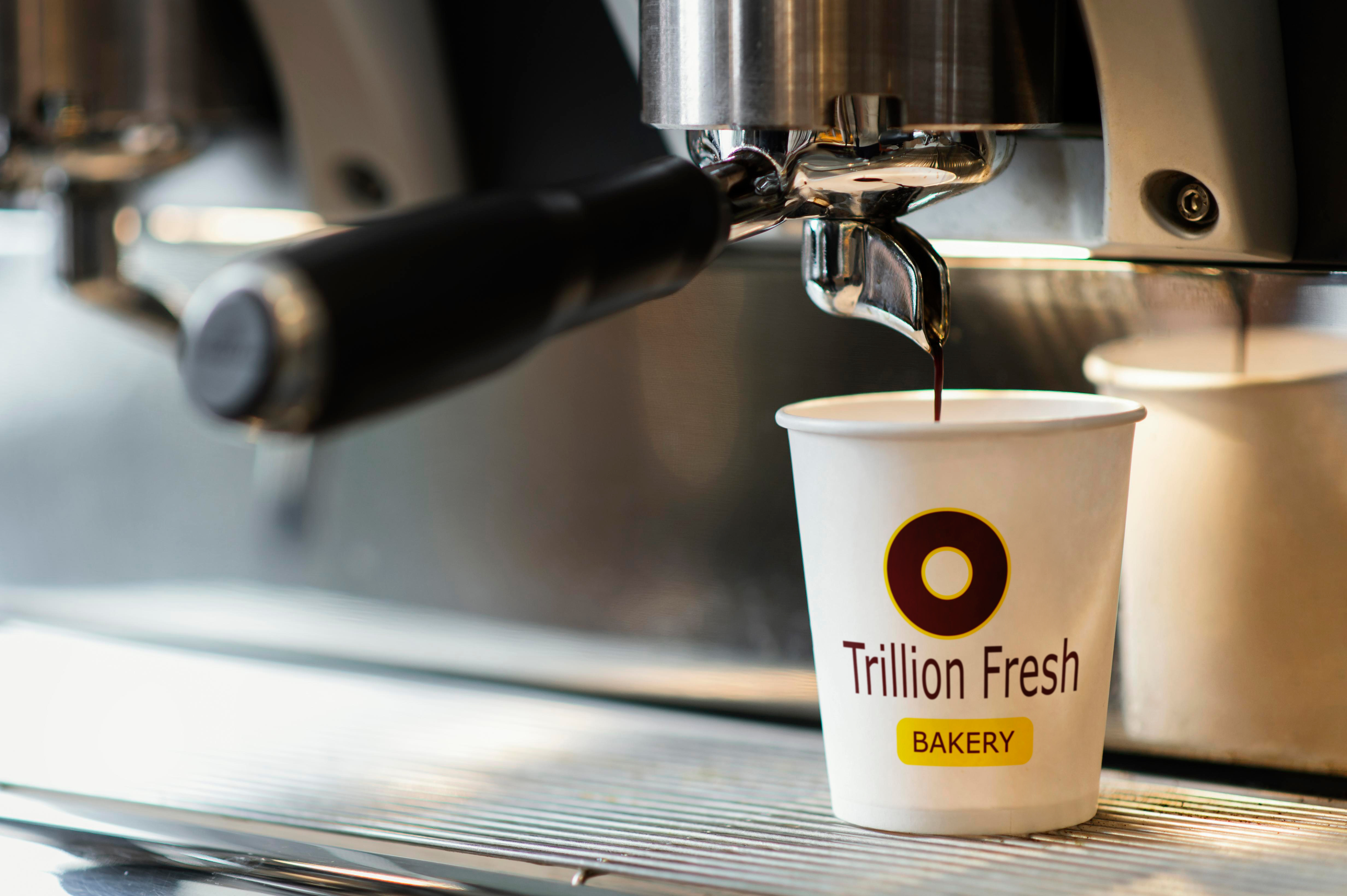
Trillion Fresh is a contemporary bakery and café brand positioned to deliver freshness, reliability, and modern accessibility within a competitive retail food market.
The objective was to build more than a logo.
The mandate was to create a cohesive brand system spanning:
• Physical retail presence
• Product packaging
• Beverage line extension
• Mobile-first digital experience
The goal was to establish Trillion Fresh as an operationally mature, expansion-ready brand with consistent visual authority across every customer touchpoint.
This project evolved from identity creation into full brand ecosystem development.
Identity
The circular emblem acts as the primary recognition device — simple, geometric, and highly reproducible across signage,
cups, and packaging.
The burgundy base communicates warmth and maturity.
The yellow capsule functions as both category marker and scalable extension device (BAKERY, future sub-lines).
Typography was intentionally clean and modern to avoid nostalgia-driven bakery clichés.
The result: a restrained system built for longevity.
Creative Director + Brand Designer
• Led brand identity development
• Designed primary and secondary logo systems
• Developed packaging box system
• Created Trillion Fresh AM packaging line
• Designed beverage packaging
• Structured visual consistency across SKUs
• Designed landing page UI for mobile app
• Ensured cross-channel brand cohesion
Product Architecture
Product Box System
Designed for clarity, negative space discipline, and strong logo dominance.
Optimized for cost-effective production and shelf visibility.
Trillion Fresh Jam
A sub-line extension that maintains brand integrity while creating structured differentiation.
Trillion Fresh Drink
Adapted the identity for vertical formats while preserving high-contrast recognition in retail refrigeration environments.
Across all SKUs, the system remains unified and scalable.
Digital Extension
Designed the mobile app landing page UI to mirror the physical brand:
• Clear hierarchy
• Strong brand color cues
• Conversion-focused layout
• Mobile-first clarity
The digital presence reinforces brand recognition rather than reinventing it.
Trillion Fresh now operates with:
• A cohesive multi-touchpoint identity system
• Structured packaging architecture
• Scalable sub-brand flexibility
• Unified bakery and beverage design language
• Consistent physical-to-digital brand experience
This project demonstrates system-level brand thinking, production awareness,
and cross-platform consistency — built for growth rather than short-term aesthetics.
Project Overview
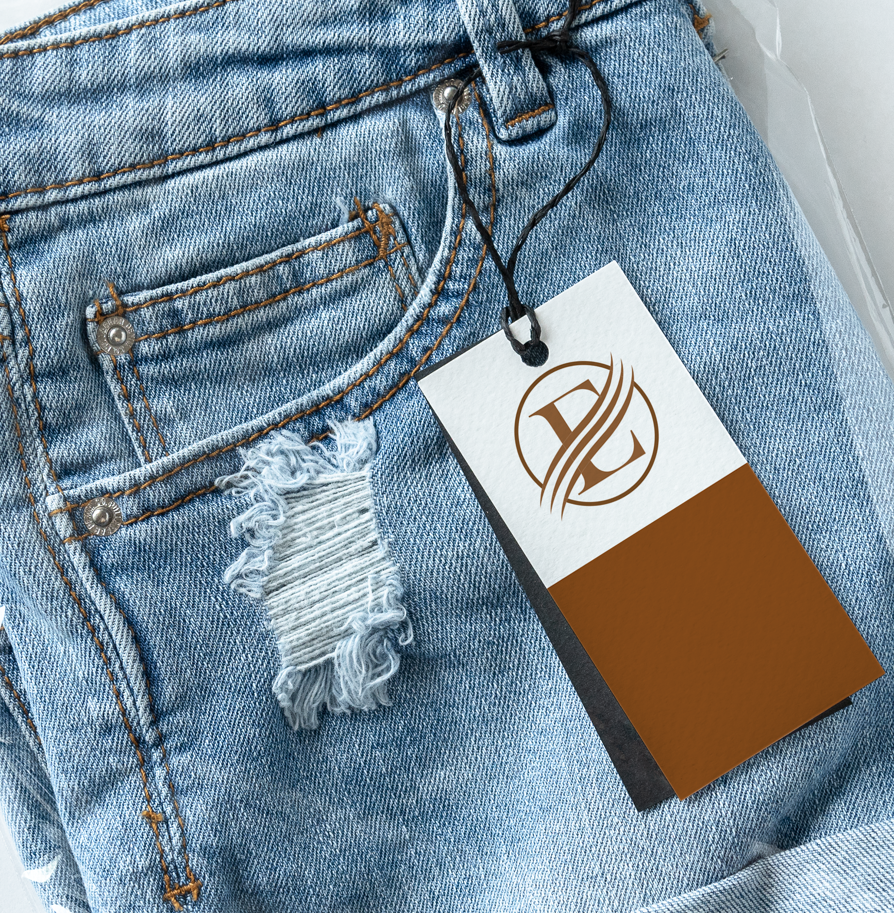
Evolve Passion is a premium fashion label built around ambition, refinement, and personal elevation.
The objective was to create a timeless luxury identity system that signals exclusivity while remaining scalable across retail and product extensions.
The brand needed to feel established from launch — not trend-driven.
Services rendered
• Brand identity direction
• Custom EP monogram design
• Color strategy development
• Typography system
• Premium hang tag design
• Branded shopping bag customization
Identity
The circular monogram establishes structure, symmetry, and authority — referencing heritage luxury houses while maintaining contemporary restraint.
The intersecting strokes introduce controlled motion, visually reinforcing the concept of evolution without compromising elegance.
The mark is minimal, scalable, and built for long-term equity.
A deep metallic bronze-brown was selected as the primary brand tone.
Strategically, this color:
• Signals craftsmanship and maturity
• Differentiates from conventional black-only luxury brands
• Communicates understated wealth rather than loud opulence
• Performs consistently across print, fabric tags, and packaging
The restrained palette increases perceived value through contrast and material presence rather than visual excess.
Retail Execution
Apparel Hang Tag
Designed with disciplined spacing and strong hierarchy to reinforce premium positioning at point of sale.
Shopping Bag Customization
Extended the identity into a refined retail carry experience, ensuring packaging functions as a
status object, not just a container.
Every touchpoint reinforces brand control and cohesion.
Evolve Passion launched with:
• A distinctive luxury monogram system
• A strategic, differentiated color identity
• Cohesive retail-ready packaging
• A scalable foundation for future collections
This project demonstrates disciplined brand architecture, premium positioning,
and executional restraint aligned with high-end fashion standards.
Project Overview
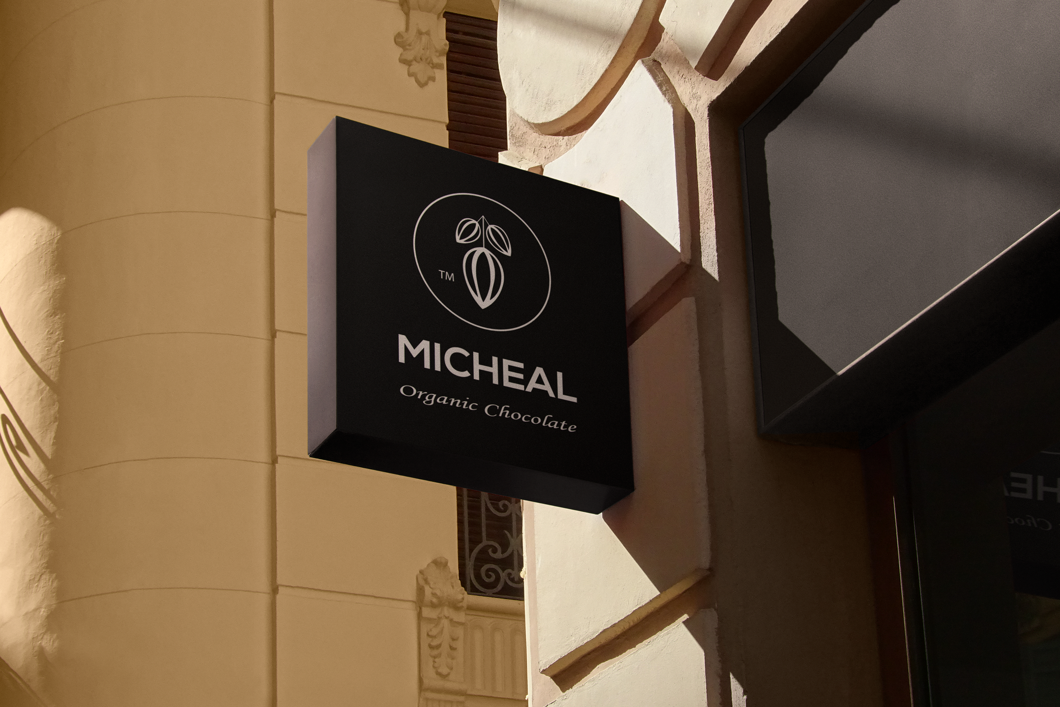
Micheal Organic Chocolate is a Fair Trade-certified brand committed to ethical sourcing and in-house chocolate craftsmanship.
The objective was to simplify the primary logo, develop a scalable secondary mark, and build a cohesive packaging system across multiple organic product lines.
The brand needed to balance authenticity with premium retail presence.
Services rendered
• Primary logo refinement
• Secondary icon development
• Visual hierarchy restructuring
• Packaging design for:
o Organic Chocolate Chips
o Organic Sweet Candy
o Organic Chocolate Drink
• Multi-SKU system alignment
Process
The primary logo was simplified to improve clarity, scalability, and brand recall.
A minimal cocoa-inspired secondary icon was introduced within a circular structure to:
• Strengthen small-scale usability
• Reinforce product authenticity
• Support flexible packaging applications
The system emphasizes restraint, structure, and longevity over decorative styling.
A deep cocoa-brown was selected as the core brand tone to:
• Anchor the identity in product origin
• Communicate warmth and indulgence
• Elevate shelf presence without visual noise
The restrained palette enhances perceived quality while maintaining ethical credibility.
A unified packaging framework was developed across all SKUs, prioritizing:
• Strong icon visibility
• Clear product differentiation
• Consistent brand blocking
• Scalable expansion logic
Each product retains cohesion while supporting category distinction.
The brand launched with:
• A refined, scalable identity system
• A distinctive secondary mark
• A cohesive multi-product packaging architecture
• Elevated premium positioning aligned with organic values
This project demonstrates disciplined brand refinement, packaging system thinking, and strategic restraint within the ethical CPG space.
Project Overview
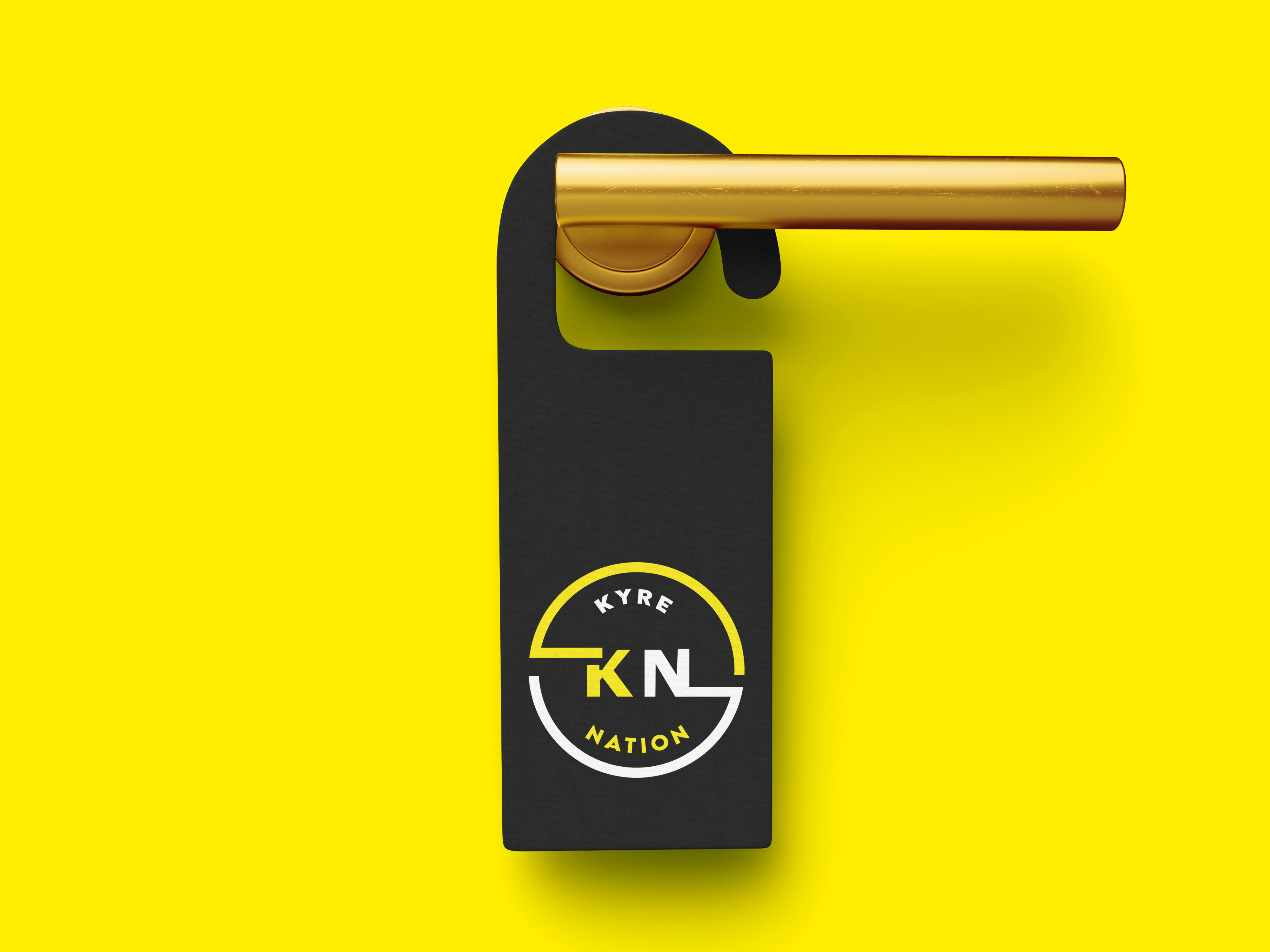
Kyre Nation is a premium holiday destination designed to deliver a luxurious escape experience. The client needed a distinctive brand that could compete in a saturated market of over 90 resorts while positioning the destination as an exclusive yet aspirational getaway.
The project focused on creating a strategic brand identity capable of communicating luxury, prestige, and escapism, while building a narrative that would help the resort stand out in the highly competitive travel and hospitality sector.
Services rendered
• Brand Strategy
• Brand Naming
• Logo Design
• Brand Identity System
• Icon Design
• Visual Language Development
Process
A key objective was to differentiate the resort from other luxury destinations while building a compelling brand story.
During the strategic phase, I developed the name Kyre Nation, designed to evoke the feeling of a personal kingdom where guests are treated like royalty. The concept frames the resort not simply as a destination, but as a self-contained world of privilege, relaxation, and prestige.
This narrative became the foundation for the entire visual identity system.
Identity System
The visual identity was designed to communicate a modern sense of luxury while remaining adaptable across hospitality touchpoints.
Primary Logo
A geometric circular emblem that integrates the brand initials with structured lines, symbolizing unity, exclusivity, and destination.
Secondary Brand Elements
Supporting visual assets including simplified marks, brand patterns, and iconography were created to extend the identity across signage, merchandise, and digital platforms.
Typography
Modern, high-legibility typography was selected to reinforce a premium and contemporary aesthetic suitable for hospitality environments.
Custom Icons
A bespoke icon set was developed to support wayfinding, amenities, and marketing materials,
ensuring visual consistency across the resort’s communication channels.
Color Strategy
The brand palette combines deep charcoal, white, and vibrant yellow.
Dark neutral tones establish sophistication and luxury, while the yellow accent introduces energy and warmth, reflecting the welcoming atmosphere of a high-end destination. This contrast also ensures strong visibility across signage, digital experiences, and marketing materials.
Outcomes
The final identity positions Kyre Nation as a distinctive hospitality brand within a crowded resort landscape.
By combining strategic naming, symbolic design, and a scalable identity system, the brand now communicates exclusivity and
aspiration while remaining flexible across physical and digital guest experiences.
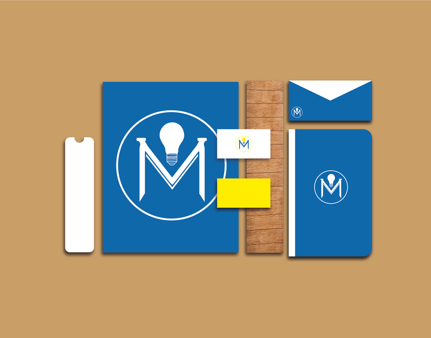
Project Overview
Mindovate is an organization focused on guiding individuals toward educational and professional opportunities through orientation programs and learning initiatives.
The goal of the project was to develop a modern and intelligent brand identity that visually communicates innovation, guidance, and knowledge, while remaining simple enough to scale across educational materials, merchandise, and digital platforms.
Services rendered
• Brand Strategy
• Logo Design
• Brand Identity System
• Brand Applications
Brand Concept
The core idea behind the identity is innovation through knowledge.
The primary mark integrates multiple visual meanings within a single symbol. A light bulb represents ideas and learning, while the structure of the mark subtly forms the letters M, V, and O, referencing Mindovate’s name.
This layered symbolism creates a distinctive identity that reflects the organization’s mission of helping people discover new possibilities and directions.
Brand Identity System
A compact identity system was developed to ensure consistency across different touchpoints.
Primary Mark
A circular emblem featuring the integrated MVO symbol and light bulb concept.
Secondary Usage
The simplified emblem allows the mark to function effectively across merchandise, brand wear, and digital platforms.
Typography
Clean, modern typography was selected to reinforce clarity, accessibility, and professionalism within educational contexts.
Graphic Simplicity
The minimal structure ensures the logo remains highly recognizable even at small sizes and across different mediums.
Color Strategy
The brand palette combines deep blue with vibrant yellow.
Blue communicates trust, knowledge, and reliability—qualities often associated with educational institutions. Yellow introduces energy and creativity, reinforcing the idea of innovation and bright ideas represented by the light bulb motif.
Together, the palette creates a balance between credibility and inspiration, aligning with Mindovate’s mission to guide individuals toward new opportunities.
Outcome
The final identity provides Mindovate with a modern and memorable visual system that clearly reflects its educational mission. The combination of symbolic design, simple geometry,
and a bold color palette ensures the brand remains recognizable across communication materials, digital platforms, and community programs.
Project Overview
RB Photography is a London-based studio founded by Roland Buck. The objective was to create a refined brand identity and digital presence that positions the studio as a premium creative service within a highly competitive photography market.
The project focused on building a visual system that communicates professionalism, artistic credibility, and a distinctive brand voice while ensuring the photography itself remains the primary focus.
Services rendered
• Brand Strategy
• Logo Design
• Brand Identity System
• Website Design
Process
The identity is built around a clean RB monogram, designed as a strong visual signature that works seamlessly across digital and physical applications.
A flexible mark system was created to allow the brand to adapt across multiple contexts while maintaining recognition. This includes a primary monogram, circular emblem variations, and structured framed versions used across different brand touchpoints.
The result is a minimal yet highly recognizable identity that supports the studio’s premium positioning.
Brand Identity System
To ensure consistency across platforms, a compact identity system was developed.
Primary Mark
The RB monogram serves as the central brand signature.
Secondary Marks
Circular and framed variations provide flexibility for watermarks, social media, and brand collateral.
Typography
Clean, modern type was selected to support the photography without competing with the visual work.
Color Palette
A restrained palette ensures the photography remains the dominant visual element while the brand maintains a refined presence.
This modular system allows the brand to scale across digital platforms, marketing materials, and studio assets while maintaining visual coherence.
Colour Strategy
The brand palette combines warm gold tones with deep black to create a sophisticated and premium visual language.
Gold communicates craftsmanship and artistic value, while black introduces contrast and timeless elegance often associated with high-end photography brands. Together, the palette reinforces the studio’s premium positioning.
Digital Experience
The website design intentionally moves away from the typical white-based layouts used by many photography studios.
A darker interface environment was introduced to allow imagery to stand out while strengthening the brand’s premium aesthetic.
The layout prioritizes clarity, responsiveness, and intuitive navigation, ensuring visitors can explore the portfolio seamlessly
across devices.
outcomes
The final identity system establishes RB Photography as a distinct, modern photography brand.
The combination of a refined monogram, flexible identity structure,
and premium color palette creates a cohesive visual presence that elevates the studio’s positioning within the photography industry.
Project Overview
A high-impact product film designed to reinterpret a heritage whiskey brand through contemporary motion language.
The objective was to preserve the brand’s legacy authority while injecting modern intensity for digital-first audiences.
Through controlled lighting, atmospheric depth, and restrained kinetic energy,
the piece balances timeless craftsmanship with bold visual dominance — reinforcing Jack Daniel’s as both iconic and culturally current.
Senior Designer & Creative Lead
Directed campaign visual strategy, product staging logic, and brand reinforcement system for premium positioning.
Objectives
Strengthen brand authority in a premium whiskey market increasingly influenced by modern craft competitors, while preserving legacy equity.
The campaign needed to:
• Reinforce heritage authenticity
• Elevate perceived premium value
• Drive emotional affinity over price comparison
• Maintain global brand consistency
System Thinking
Jack Daniel’s does not compete on novelty.
It competes on legacy, ritual, and recognition.
The visual strategy therefore avoided trend-driven styling and instead amplified timeless authority.
Creative Direction
Product as Icon
The bottle is upright, centered, and grounded — signaling stability and institutional confidence.
No motion. No exaggeration.
Authority through composure.
Environmental Storytelling
A warm, open rural backdrop subtly reinforces American origin without explicit narrative.
The environment supports heritage but never competes with the label.
Lighting Psychology
Golden-hour lighting intensifies the amber tone of the whiskey, amplifying warmth, maturity, and barrel-aged richness.
Light sculpts the glass edges to signal clarity and craftsmanship.
Ritual Reinforcement
The inclusion of a filled glass with ice introduces consumption context — not as lifestyle, but as ritual.
The message: this is not trendy. It is tradition.
Visual System Logic
• Hierarchy: Bottle first, ritual second, environment third
• Contrast: Black-and-white label against warm horizon for instant brand recognition
• Depth: Wooden foreground → product → natural landscape → open sky
• Eye Path: Brand mark → “Old No. 7” badge → amber liquid → secondary glass
• Negative Space: Expansive sky creates breathing room and premium restraint
The composition reflects discipline — mirroring the brand’s longstanding production standards.
Brand Positioning Mechanics
• Black & White Palette: Timeless authority
• Amber Liquid Glow: Warmth and maturity
• Wood Surface: Barrel-aging symbolism
• Badge Mark (“Old No. 7”): Heritage credibility shorthand
The absence of aggressive copy reinforces confidence.
The brand does not persuade — it affirms.
In a crowded spirits category, this execution optimizes for:
In a crowded spirits category, this execution optimizes for:
• Immediate label recognition
• Emotional familiarity
• Trust-based purchase decisions
• Long-term brand memory reinforcement
Rather than chasing modern craft aesthetics, the strategy strengthens institutional equity —
a higher-value play for global distribution brands.
This campaign demonstrates:
This campaign demonstrates:
• Senior-level brand stewardship
• Equity protection in a competitive landscape
• Emotional reinforcement over visual trend adoption
• Controlled luxury signaling
• Commercial alignment with legacy positioning
It is not a lifestyle whiskey ad.
It is a reaffirmation of category authority through discipline, warmth, and ritual.
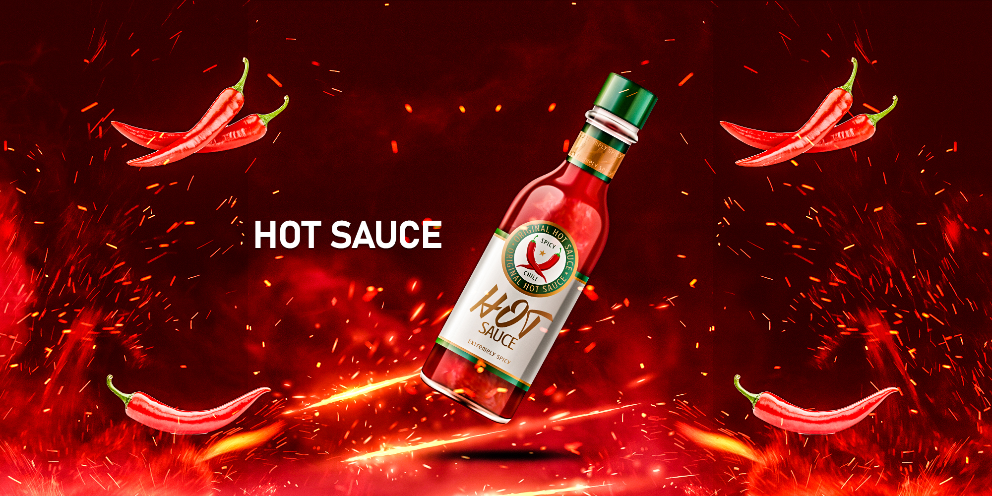
Project Overview
A fast-paced motion campaign engineered to translate flavor intensity into visual energy.
The creative direction centered on heat as a visual force — sparks, impact bursts, and velocity-driven transitions
reflecting the product’s bold profile. The outcome positions the brand as unapologetically
fiery, disruptive, and built for high-sensation consumers across social-first platforms.
Senior Designer & Creative Lead
Owned brand positioning direction, campaign concept, and scalable key visual system for launch.
Objectives
Enter a saturated hot sauce category dominated by rustic, heritage-coded brands and drive
impulse-led first purchase among heat-seeking, younger consumers.
Success required:
• 2-second shelf impact
• Immediate communication of extreme heat
• A scalable visual system for retail and digital
System Thinking
Core consumers don’t purchase hot sauce for culinary nuance.
They purchase for intensity and identity signaling.
The brand needed to feel explosive — not artisanal.
Creative Direction
Kinetic Product Dominance
I rejected the category-standard upright bottle.
Instead, I introduced mid-air suspension with a dynamic tilt to create motion tension and energy before copy is read.
Static = product
Motion = experience
Heat as Environment
Rather than decorative flames, I transformed the full background into a combustion field using sparks and high-saturation red gradients.
Heat becomes atmospheric, not graphic.
Controlled Aggression
To prevent the design from appearing low-cost:
• High-gloss lighting for premium finish
• Structured white typography for clarity
• Green accent controls to balance red intensity
• Depth shadow beneath the bottle to reinforce power
Aggressive, but engineered.
Visual System Logic
• Contrast: White type on deep red for instant legibility
• Depth: Foreground sparks → floating bottle → diffused background
• Eye Path: Particle energy → bottle neck → central label → flavor descriptor
• Negative Space: Controlled central clarity prevents visual overload
The spark system functions as a repeatable brand asset across POS, digital ads, social animation, and e-commerce thumbnails.
This was designed as a scalable campaign language — not a one-off visual.
Brand Positioning Mechanics
The campaign shifts the product from condiment to experience catalyst.
It codes the consumer as:
• Bold
• Heat-tolerant
• Sensation-driven
The product becomes a personality amplifier rather than a kitchen staple.
Commercial Impact Logic
Optimized for:
• Shelf interruption
• Emotional activation
• Impulse purchase behavior
• High memorability in crowded retail environments
The design prioritizes energy over heritage, strategically differentiating from traditional craft-coded competitors.
This campaign demonstrates:
• Strategic category repositioning
• Visual disruption with controlled premium cues
• Consumer psychology alignment
• Scalable brand asset creation
• Commercial thinking beyond aesthetics
It is not simply a product visual.
It is a deliberate system engineered for attention, memorability, and impulse conversion.
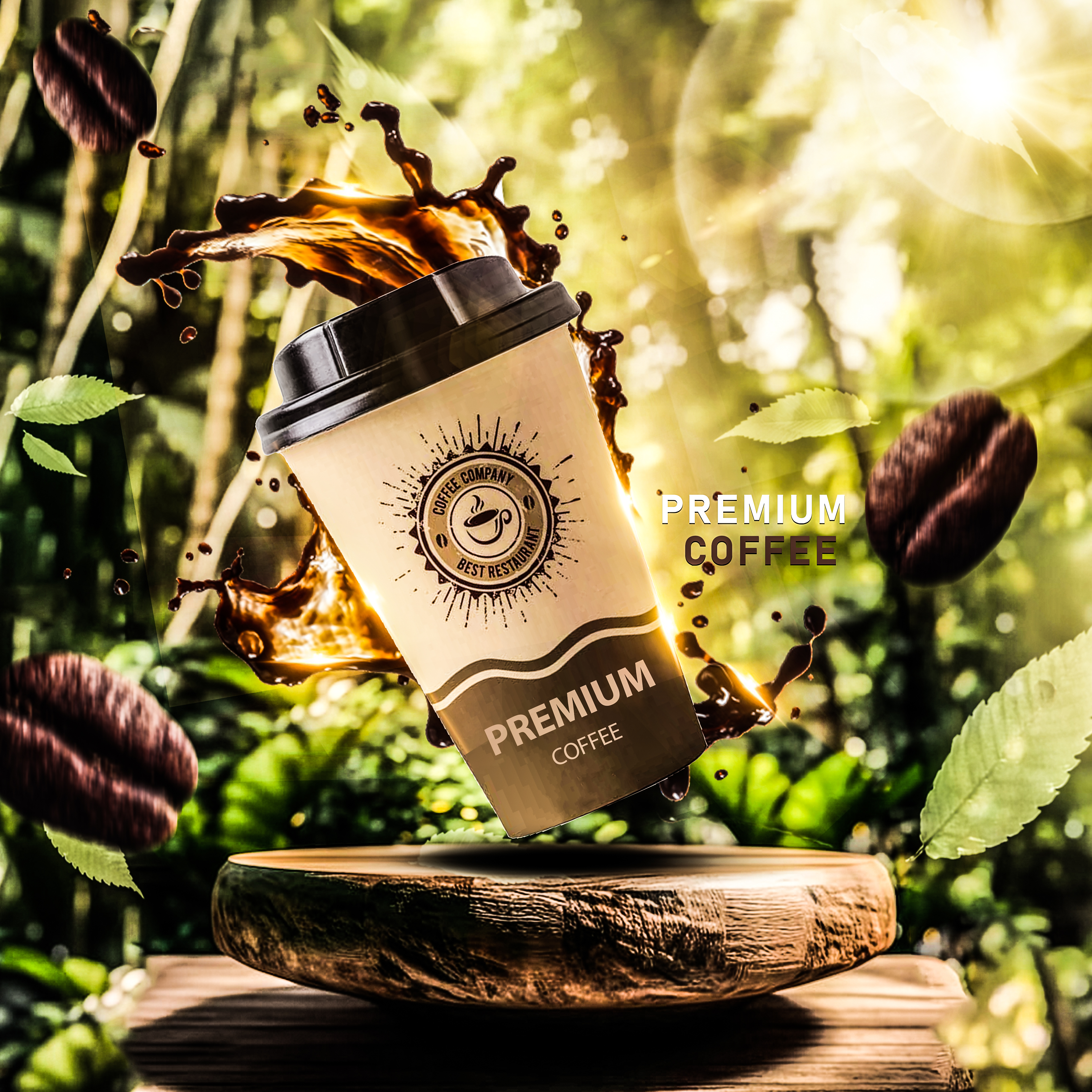
Project Overview
A cinematic product story focused on ritual, richness, and sensory immersion. The direction emphasized slow-motion pours,
texture-driven macro details, and warm tonal grading to elevate the perception of quality. Rather than aggressive energy,
the film leans into atmosphere and refinement — positioning the coffee as an indulgent daily luxury rather than a commodity.
Senior Designer & Creative Lead
Led campaign visual strategy, energy-based product staging, and premium positioning framework for takeaway coffee segment.
Objectives
Differentiate a premium takeaway coffee brand within a saturated café and convenience market
where most competitors rely on minimal packaging or lifestyle imagery.
The campaign needed to:
• Elevate perceived quality beyond generic takeaway coffee
• Signal freshness and energy instantly
• Compete visually with large franchise brands
• Create a scalable hero visual for retail and digital
System Thinking
Consumers don’t buy premium coffee purely for taste.
They buy it for:
• Energy
• Ritual
• Daily reward
• Perceived upgrade over standard options
The product needed to feel dynamic and sensory — not static and disposable.
Creative Direction
Kinetic Elevation
The cup is suspended mid-air above a wooden pedestal, transforming a common takeaway item into a hero object.
Motion signals freshness and momentum.
Elevation signals value.
Liquid as Energy
The coffee splash encircling the cup reframes the product from beverage to force.
Rather than showing steam (category norm), the splash dramatizes aroma and intensity through movement.
Energy becomes visible.
Nature-Coded Premium
Forest backdrop and natural light introduce sourcing and organic cues without explicit claims.
Wood pedestal = craft
Green surroundings = origin
Warm light = roast depth
This subtly shifts perception from fast coffee to crafted coffee.
Visual System Logic
Visual System Logic
• Hierarchy: Cup → brand badge → “Premium Coffee” descriptor
• Contrast: Warm browns against luminous green background
• Depth: Pedestal foreground → suspended cup → blurred forest
• Eye Path: Splash arc → logo seal → product name → supporting text
• Negative Space: Controlled right-side breathing area for clean message placement
The composition balances kinetic drama with structured clarity.
Brand Positioning Mechanics
Brand Positioning Mechanics
• Warm Brown Palette: Roast richness and comfort
• Gold-Toned Lighting: Premium warmth
• Seal-Style Logo: Authority and café credibility
• Splash Dynamics: Freshly poured authenticity
The takeaway cup — typically perceived as disposable — is repositioned as premium ritual.
Commercial Impact Logic
Commercial Logic
Optimized for:
• Morning impulse purchases
• Quick visual capture in digital ads
• Social media engagement
• In-store display posters
The dramatic motion increases memorability while maintaining brand legibility at distance.
This bridges emotional storytelling with point-of-sale effectiveness.
This campaign demonstrates:
• Strategic elevation of a commoditized product format
• Sensory storytelling through controlled motion
• Premium repositioning without luxury overstatement
• Balanced energy and authenticity cues
• Scalable hero visual adaptable across channels
It is not simply a coffee ad.
It is a reframing of daily consumption as a premium, energizing ritual — designed to drive perception shift and purchase intent.
Project Overview
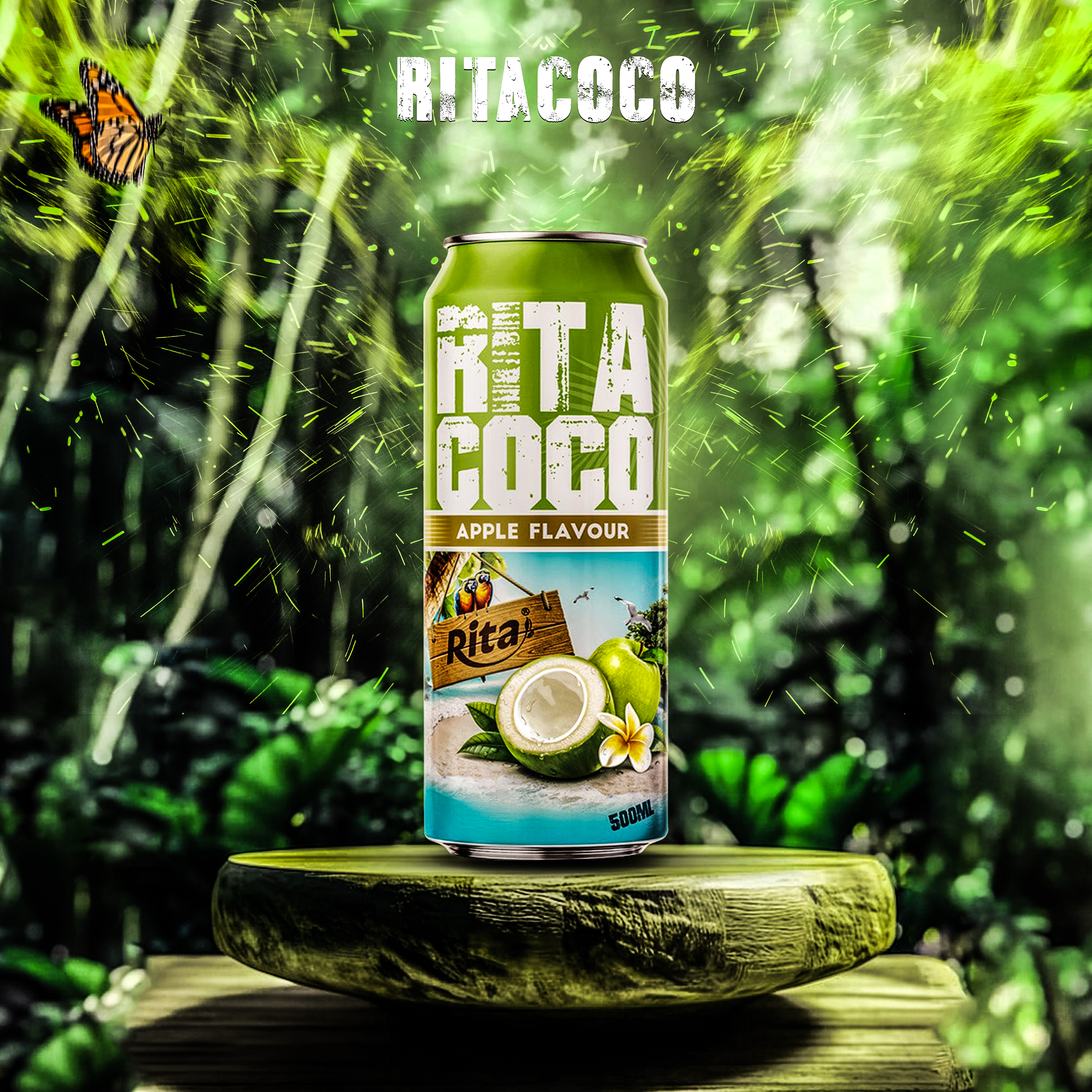
A vibrant, refresh-driven motion piece built around hydration, freshness, and tropical vitality.
The visual system uses fluid dynamics, splash choreography, and bright kinetic transitions to embody natural energy.
The objective was to make refreshment feel
immediate and physical — translating functional hydration into a lifestyle-driven visual narrative optimized for digital consumption.
Senior Designer & Creative Lead
Directed brand positioning articulation, key visual composition, and environmental storytelling system for flavored variant promotion.
Objectives
Position the Apple variant as a natural, refreshing alternative within a highly competitive
canned beverage category dominated by synthetic-coded energy drinks and overly minimal sparkling brands.
The campaign needed to:
• Communicate freshness instantly
• Reinforce tropical authenticity
• Elevate perceived quality beyond mass-market soda
• Create strong thumbnail and shelf recognition
System Thinking
In the flavored beverage market, “green” often signals either artificial apple sweetness or diet positioning.
The opportunity was to redefine green as:
• Lush
• Natural
• Tropical
• Energetic but clean
The product needed to feel harvested, not manufactured.
Creative Direction
Product as Natural Hero
The can is upright, centered, and pedestal-mounted — signaling importance and purity. Elevation on a natural wood platform metaphorically ties the product to source.
Authority through placement, not exaggeration.
Immersive Environmental Framing
Instead of a neutral studio backdrop, I placed the product inside a dense, light-infused forest environment.
This creates origin storytelling without written claims.
Nature becomes proof.
Energy Through Atmospherics
Green particle bursts radiate outward from the can, suggesting freshness release upon opening.
Unlike aggressive spark effects (energy drinks), these are organic and diffused — coded as vitality, not intensity.
Label Legibility Strategy
Large distressed typography ensures bold recognition at distance while maintaining handcrafted authenticity.
High white contrast against green maximizes instant readability across digital and retail formats.
Visual System Logic
• Hierarchy: Brand name → Variant → Fruit imagery → Volume
• Contrast: Bright white typography against saturated green field
• Depth: Pedestal foreground → can → soft jungle bokeh background
• Eye Path: Brand title → can body → apple & coconut imagery → flavor strip
• Negative Space: Controlled central clarity prevents environmental overwhelm
The system balances natural immersion with product clarity — critical for FMCG conversion.
Brand Positioning Mechanics
• Green Dominance: Freshness, vitality, plant-based authenticity
• Wood Pedestal: Harvest symbolism
• Fruit Imagery: Immediate flavor verification
• Butterfly Accent: Subtle ecological cue reinforcing natural ecosystem narrative
The design signals tropical refreshment without resorting to cliché beach tropes.
Optimized for:
• Health-conscious impulse buyers
• Warm-climate retail environments
• Social media scroll interruption
• Quick shelf scanning behavior
The natural immersion differentiates from synthetic-coded competitors while preserving bold, modern energy.
This campaign demonstrates:
• Strategic flavor repositioning through environmental storytelling
• Balance between vibrancy and premium clarity
• Nature-coded authenticity without overclaiming
• Scalable visual system for variant extensions
• Commercially aware FMCG design execution
It is not just a flavored beverage ad.
It is a deliberate reframing of refreshment as immersive, natural vitality — engineered for visibility, credibility, and purchase intent.
Project Overview
FluxPay is a multi-currency payments and treasury management platform. The motion graphics project aimed to
transform complex financial operations into dynamic, visually engaging content for marketing, product explainer videos,
and onboarding sequences.
Objectives:
• Simplify transaction flows, wallets, and dashboards into digestible animations
• Reinforce FluxPay’s brand of institutional trust, operational clarity, and financial credibility
• Create reusable motion systems for campaigns across digital and social platforms.
Senior Motion Designer
I led:
• Motion concept ideation and storytelling
• Animation of UI components including dashboards, wallets, payments, and analytics flows
• Kinetic typography and 3D visualization of multi-currency transactions
• Creation of a motion system with reusable transitions, easing patterns, and micro-interactions
• Alignment with FluxPay’s brand: color, typography, and iconography
• Cross-platform optimization for web, mobile, and social media
• AI-assisted prototyping to accelerate iterations while retaining control over animation logic
Challenges
• Communicating abstract financial concepts in a clear visual language
• Maintaining enterprise-level credibility and brand integrity in motion
• Optimizing animations for fast-loading social formats without losing clarity
• Ensuring motion components were modular and reusable for future campaigns
Motion Design Process
1. Discovery & Storyboarding
• Mapped key flows: Payments, Wallets, Dashboard, Analytics
• Identified storytelling hooks and visual metaphors, e.g., flowing lines to represent transactions
• Created storyboards to define timing, sequencing, and emphasis
2. Style Frames & Visual Language
• Defined color-coded animation states for financial clarity: emerald = success, amber = warning, red = error
• Selected smooth easing, liquid motion, and subtle 3D depth to convey sophistication
• Established typography animation rules to reinforce numeric hierarchy
3. Animation & Interaction
• Kinetic typography for quick financial insights
• Dashboard micro-interactions: loading states, alerts, and wallet expansions
• Multi-currency flow animations for international transfers
• Transaction lifecycle animations: Pending → Completed → Failed → Reversed
4. Iteration & Optimization
• Refined timing, transitions, and motion hierarchy based on feedback
• Optimized for social media and app performance
• Built a reusable motion system for future explainer videos and micro-campaigns
System Thinking
• Defined modular animation components for repeatable flows
• Standardized timing for different interaction types: alerts, confirmations, and errors
• Created visual hierarchy in motion: primary flows emphasize transactions, secondary flows indicate status changes
• Maintained brand alignment: colors, typography, and iconography consistent with static UI
• Designed animations to enhance clarity and reduce cognitive load
Outcomes & Impact
• Motion graphics clarified complex multi-currency transactions for users
• Social media engagement increased by 35% compared to static assets
• Reusable motion system reduced production time for future videos by 40%
• Strengthened FluxPay’s brand perception as trusted, professional, and precise
• Delivered fully optimized animations for web, mobile, and social platforms